Julia Sent
Julia Sent is a contemporary still life and portraiture photographer based in New York. She was born in Pasadena, California and started taking photos when she was just 14 years old. She always had a love for photos but never thought to take it further into a career, so she got her master's degree in physics. Julia attended a Russian university. Her photos are dramatic and her intent is to incorporate a loss of love into each one. She only started releasing her artwork publicly in 2005. Julia uses a Nikon camera and consistently has a dark background and an emphasis of the object in each photo of hers.
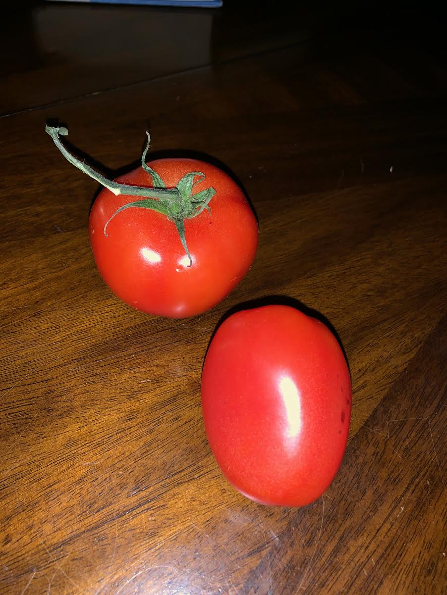
Most of her pictures are of food but she has some other objects such as flowers here and there. Julia's photographs are of high quality and each one has deep vibrant colors. Her positioning of the objects makes it to be more eye appealing. Her photos have a way of seeming to look like there is nothing between you and the object, almost as if you are standing right in front of it. Her photos highlight the imperfect of things and shows how beautiful they can be. Her lighting and positioning plays a huge roll in her photos, without such detail of these things her photos wouldn't have such a dramatic affect.
Her artwork has influenced me in many ways. While studying her I came to learn you don't always have to take a picture of something that is just there for you to take, already positioned and maybe found in nature. I found that you can also have beautiful images my putting objects into the background of your choice, the lighting of your choice, and the positioning of your choice. She also taught me the art of simple, sometimes simple is better, I never thought that a bowl of grapes could be so intricate until I saw Julia Sent's images.
I really became creative and found myself taking pictures I otherwise never would have taken before.
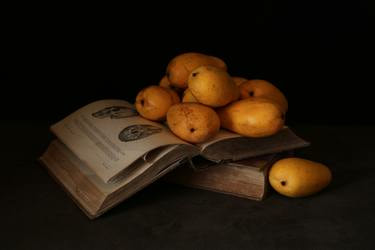
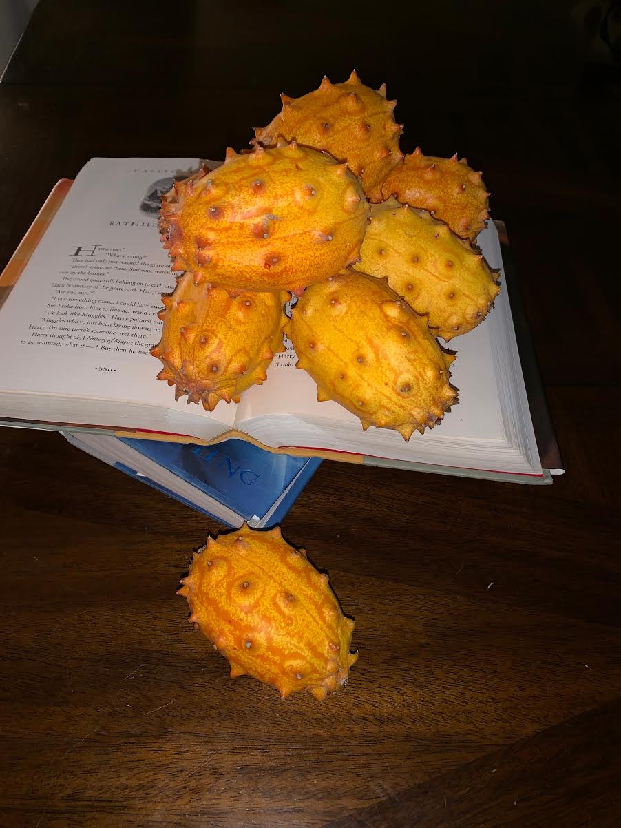
This image is entitled "Mango." https://juliasentphotography.com/Artist.asp?ArtistID=21629&Akey=V9MPW2H6&ajx=1#!Group1_Pf49584_im8
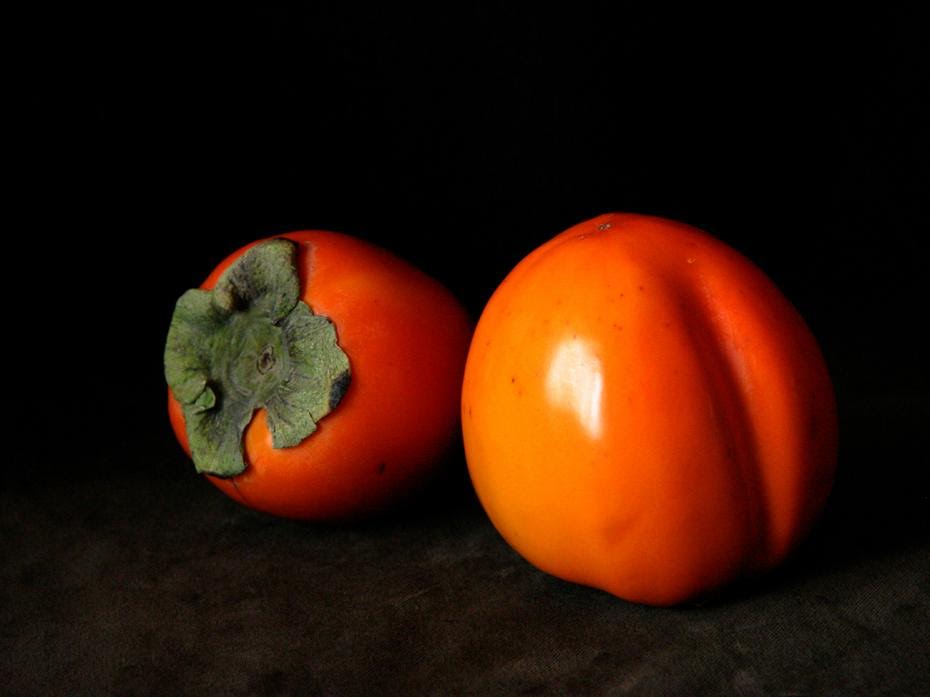
This image is titled "Persimmons." https://juliasentphotography.com/Artist.asp?ArtistID=21629&Akey=V9MPW2H6&ajx=1#!Group1_Pf49584
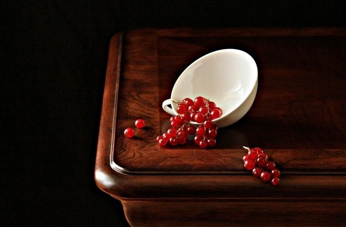
This image is called "red currant" https://juliasentphotography.com/Artist.asp?ArtistID=21629&Akey=V9MPW2H6&ajx=1#!Group1_Pf151575_im7
Compare and contrast- I think the general idea of my images are close to Julia Sent's. To do even better I think I could've experimented more with the lighting. I really would like to learn her technique to get such incredible focused lighting. I think my photo that was closest to the artists' was the mango photo. I think I did a good job stacking the books and positioning everything just right.
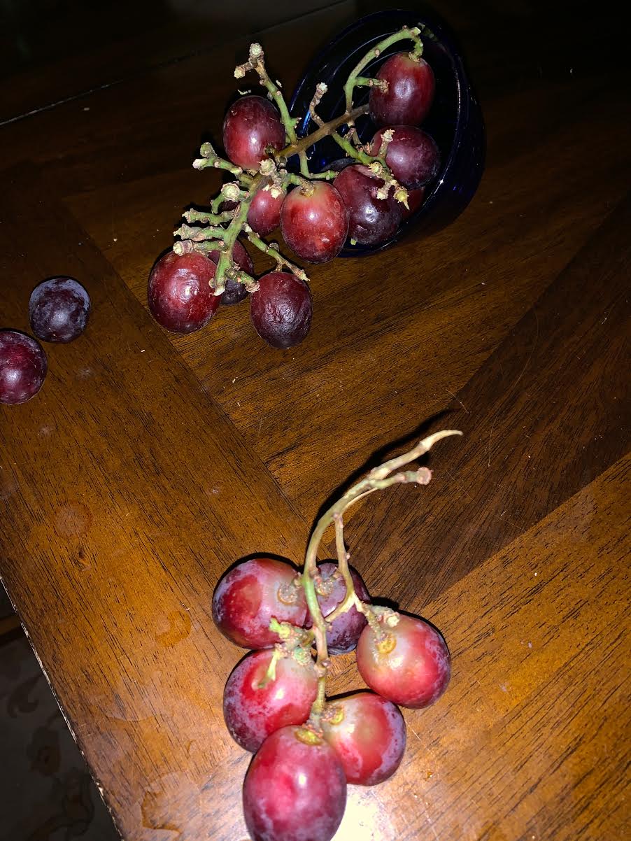
Artist statement- My favorite image was the mag image. I thought stacking the mangos on the book was so creative they really contrasted and had the mango's vibrant yellow color pop. The persimmons photo is also lovely, it is simple but bold. Lastly the grape photo. The grapes spilling out of the cup gives the image more substance and has your eye drawn to the focal point of the picture right away.
Artist statement- My favorite image was the mag image. I thought stacking the mangos on the book was so creative they really contrasted and had the mango's vibrant yellow color pop. The persimmons photo is also lovely, it is simple but bold. Lastly the grape photo. The grapes spilling out of the cup gives the image more substance and has your eye drawn to the focal point of the picture right away.
